Build and maintain an enterprise scale design system for a retail giant.
As an Art Director at Timberland, I was apart of and sometime led a team of 12 talented individuals, all focused on enhancing UI and UX experiences across various websites within VF Corp’s ecosystem. Each team member was dedicated to specific brands such as Timberland, Vans, or The North Face. Our primary goal was twofold:
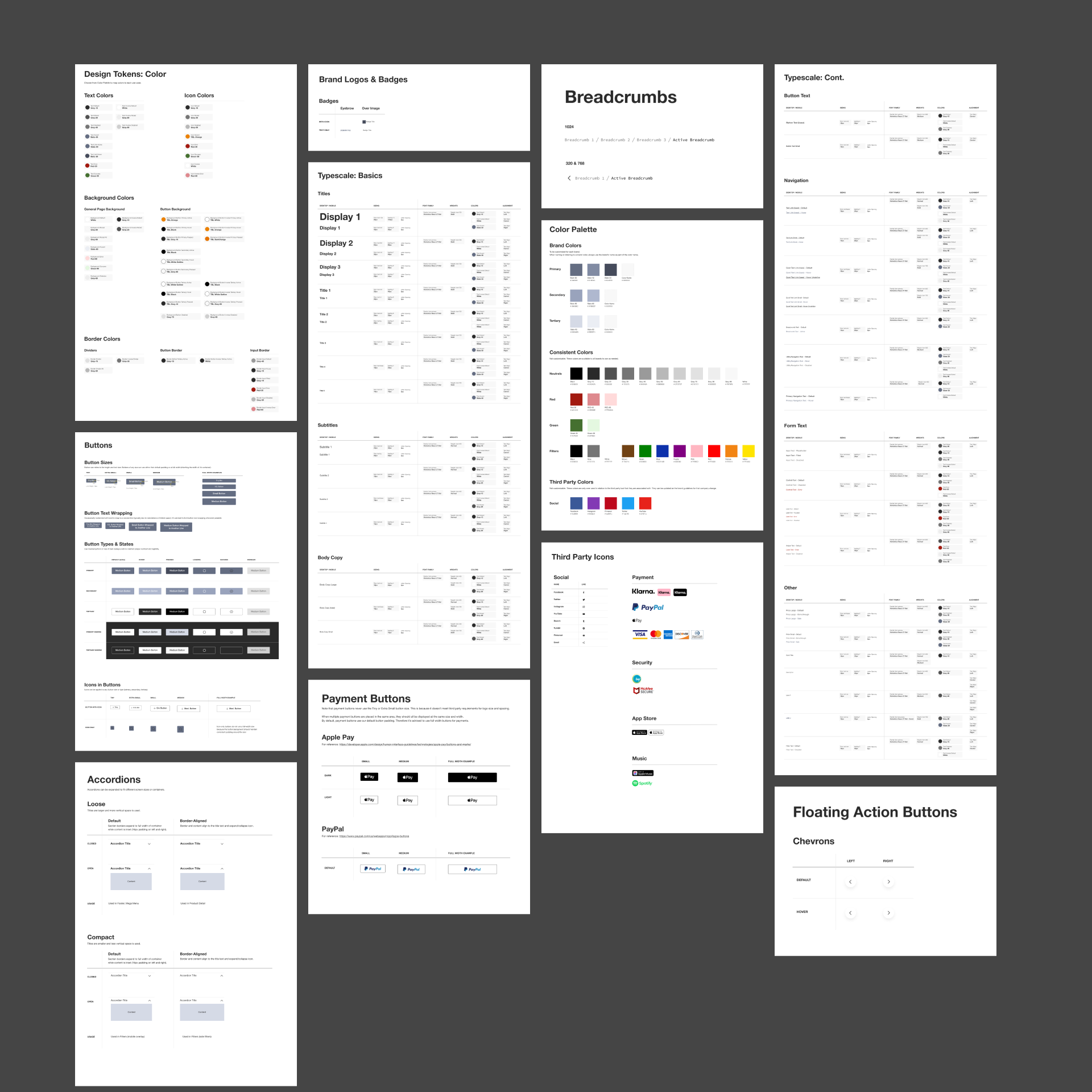
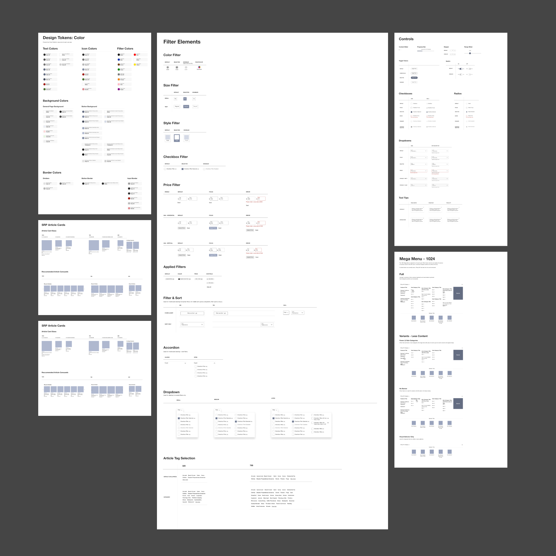
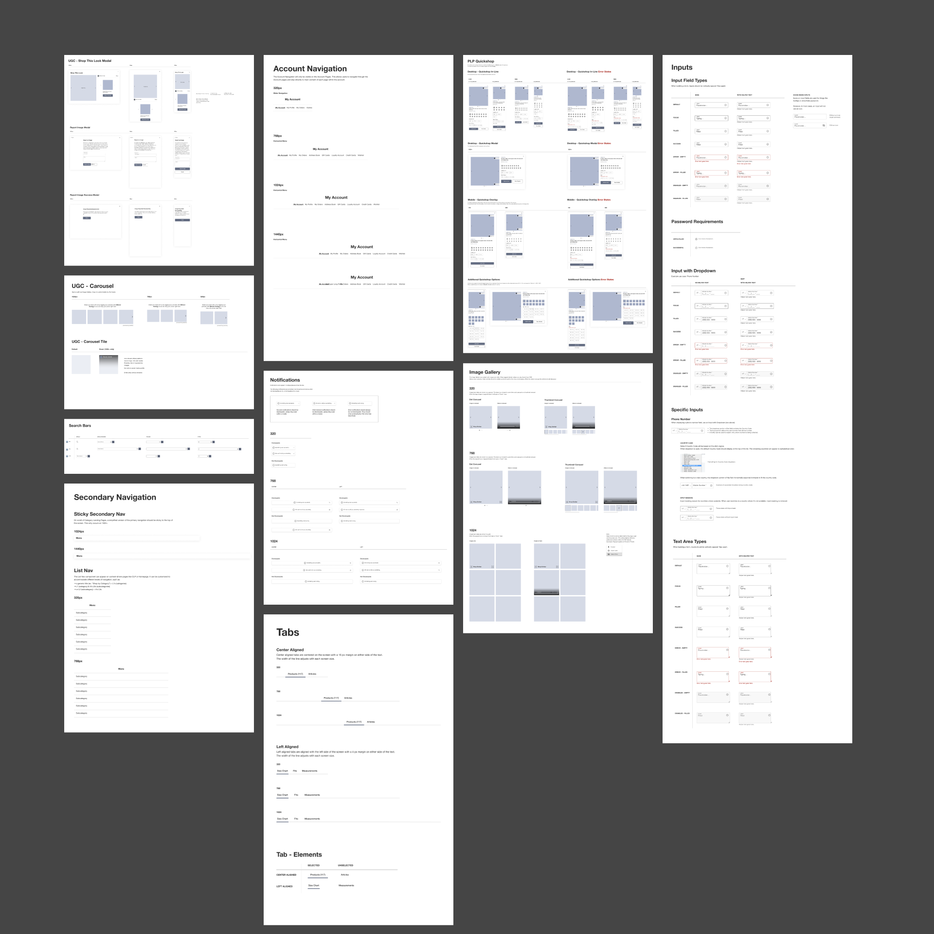
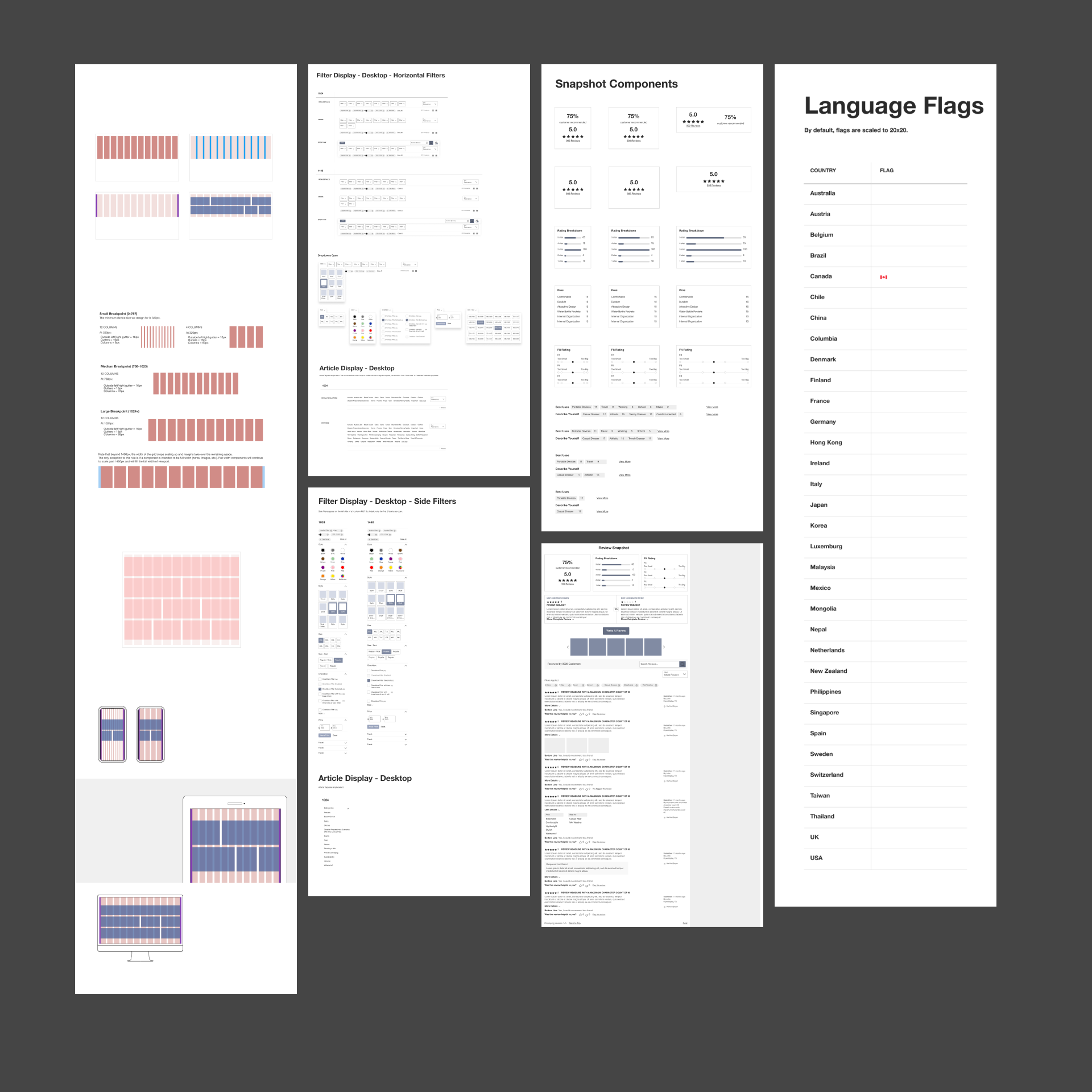
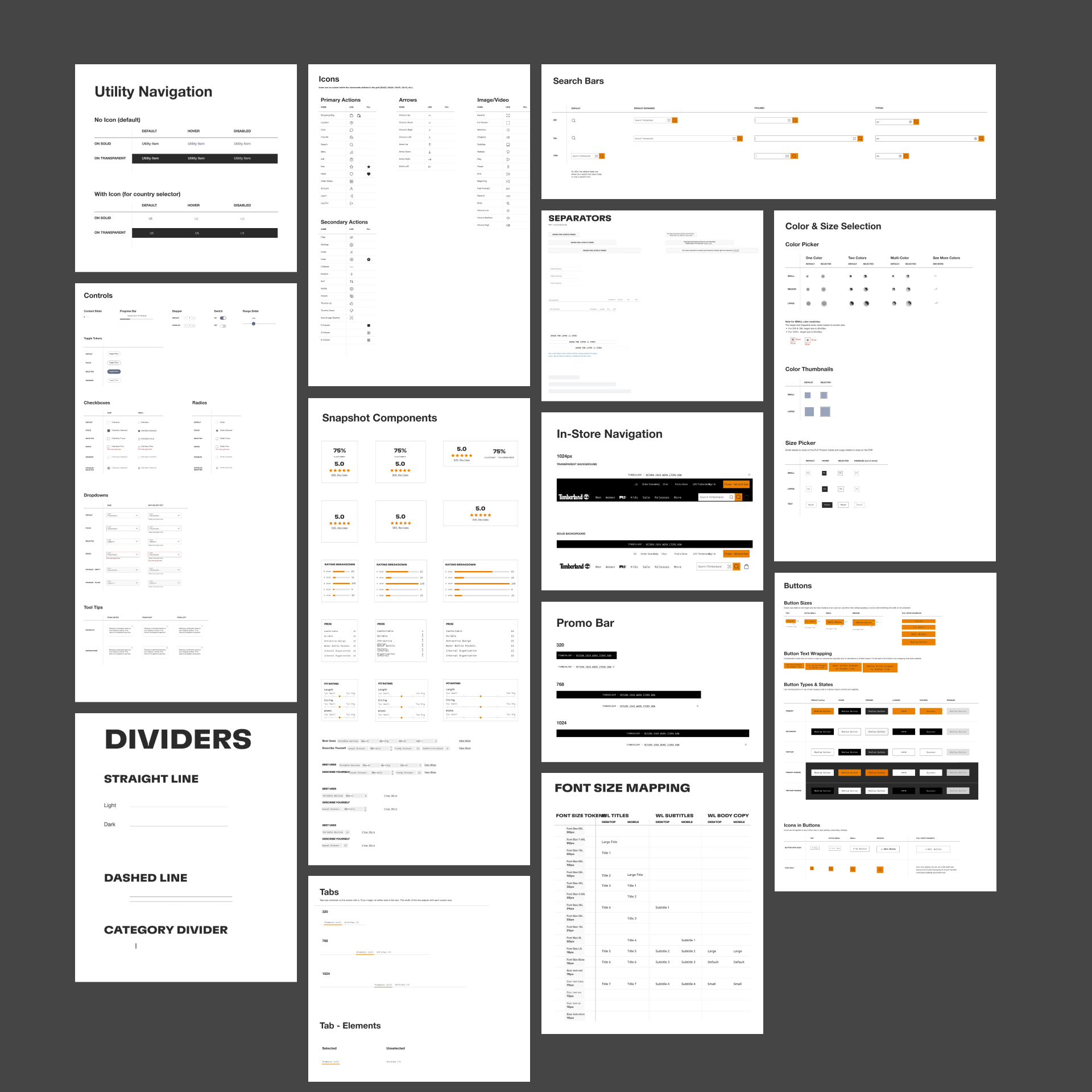
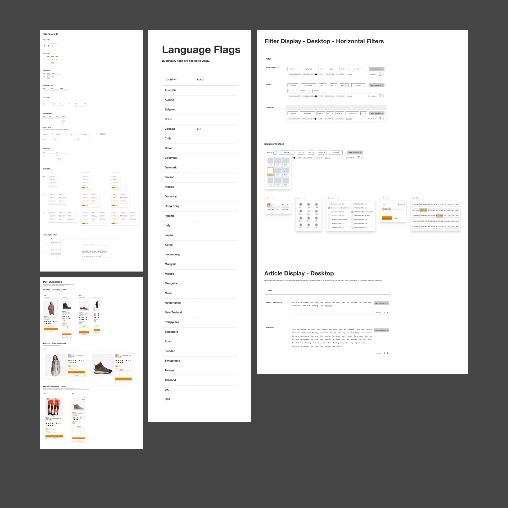
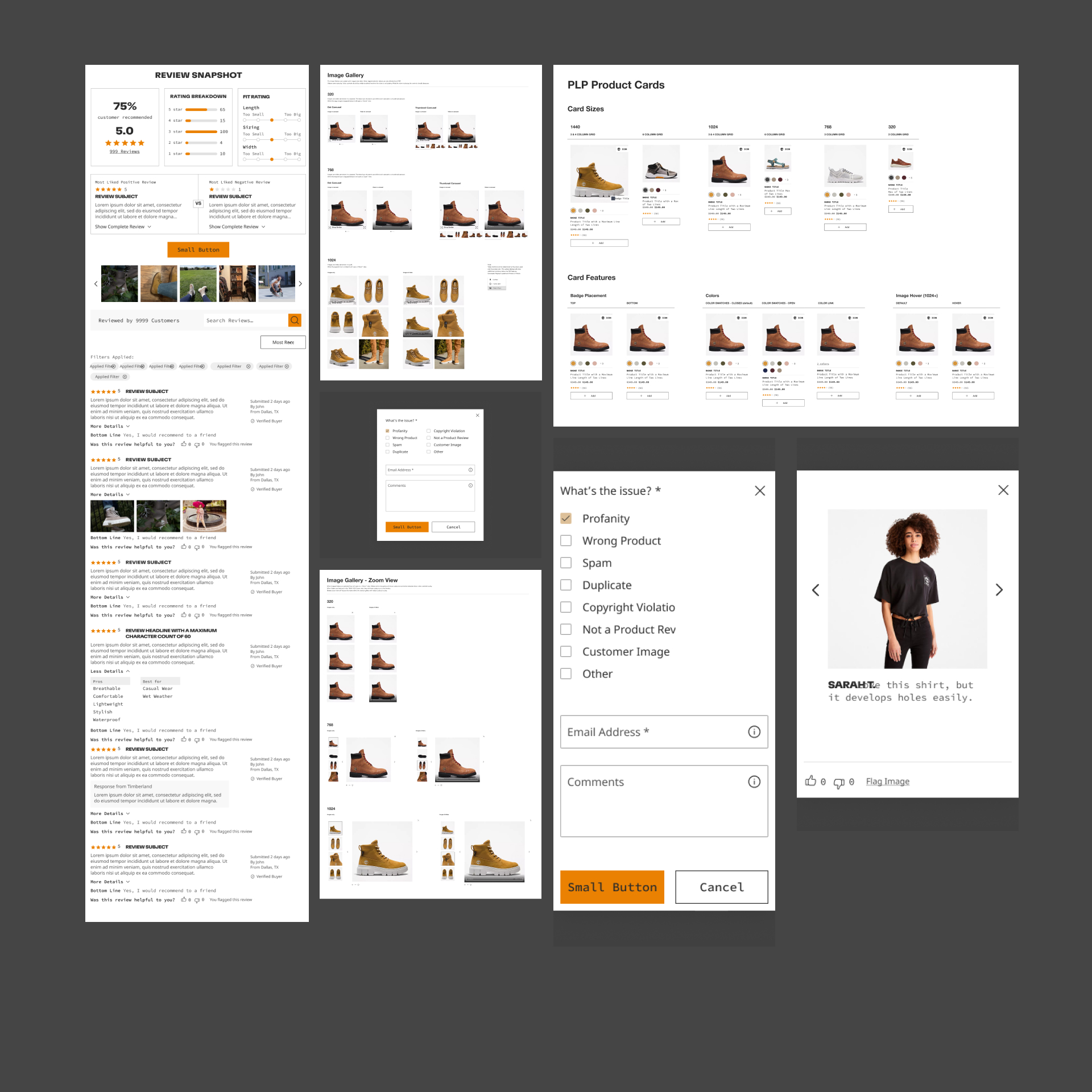
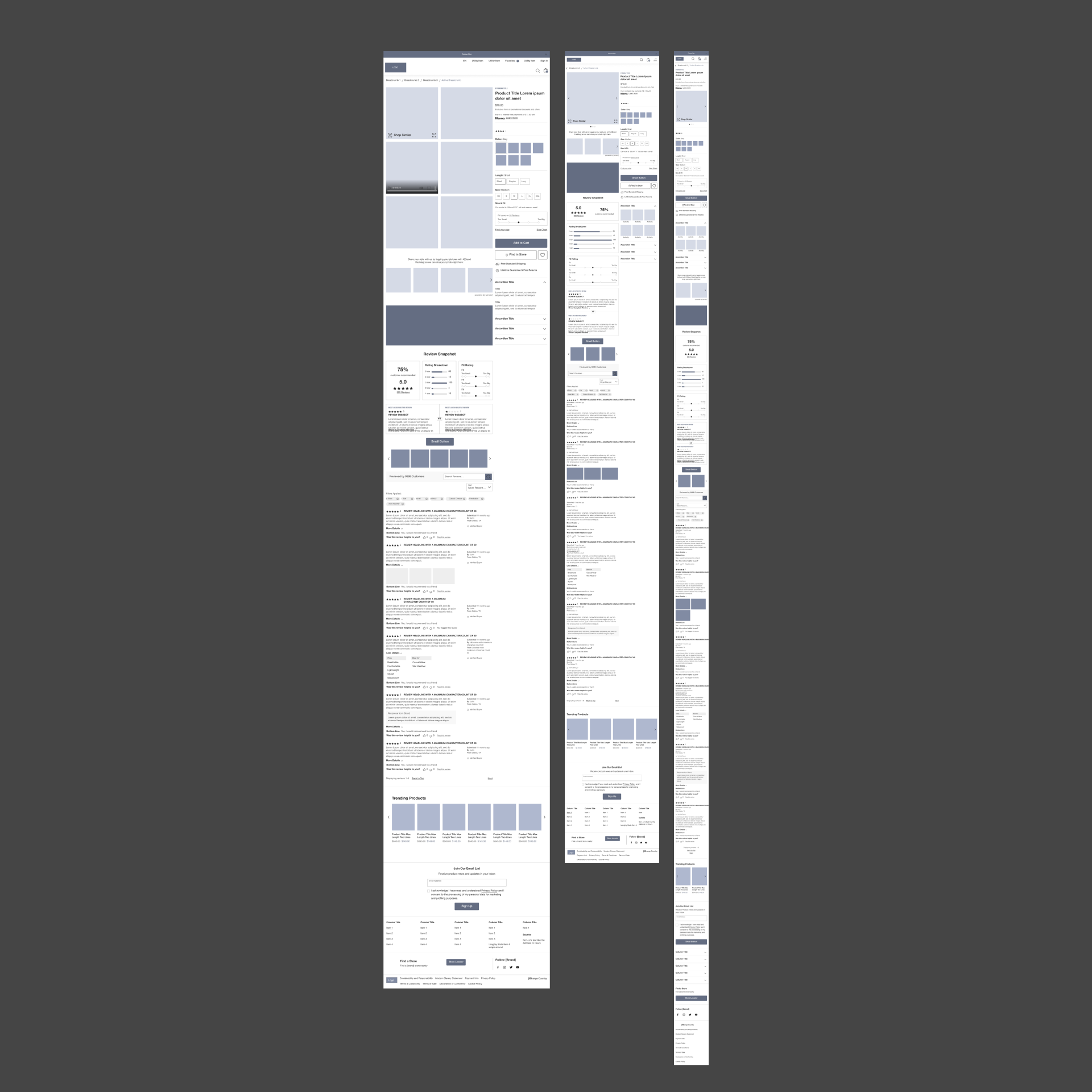
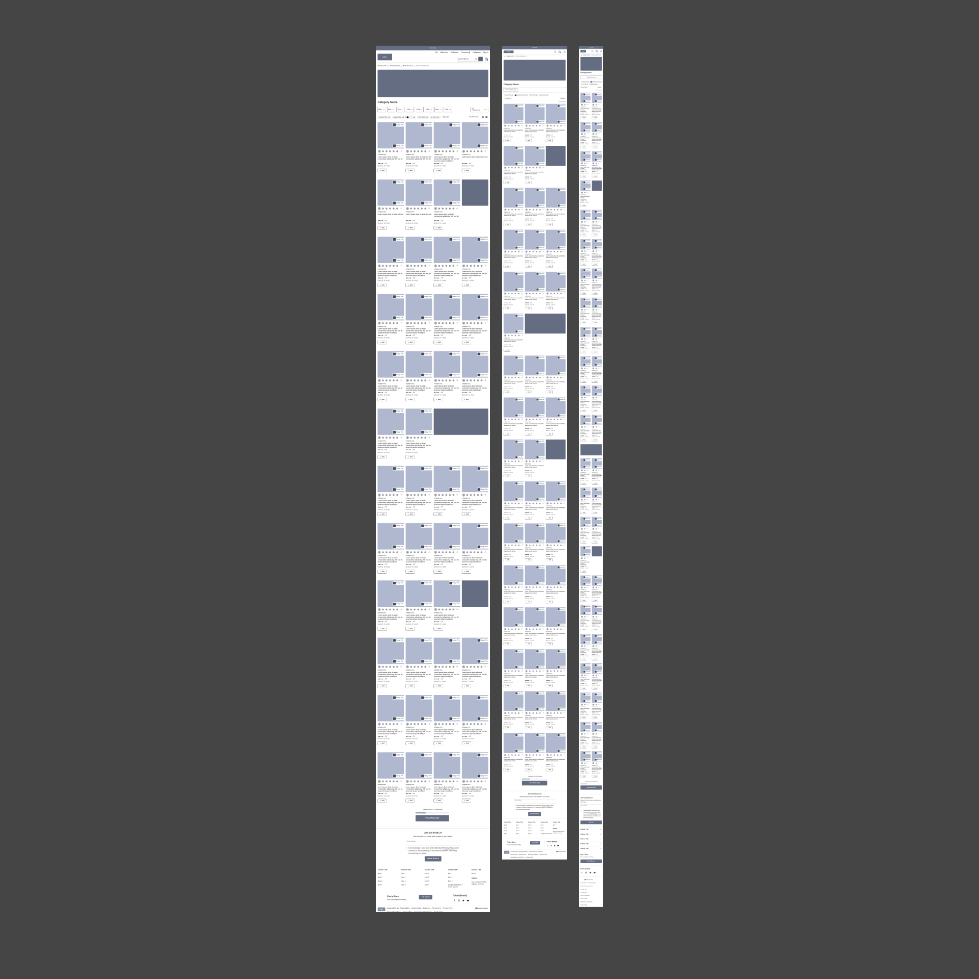
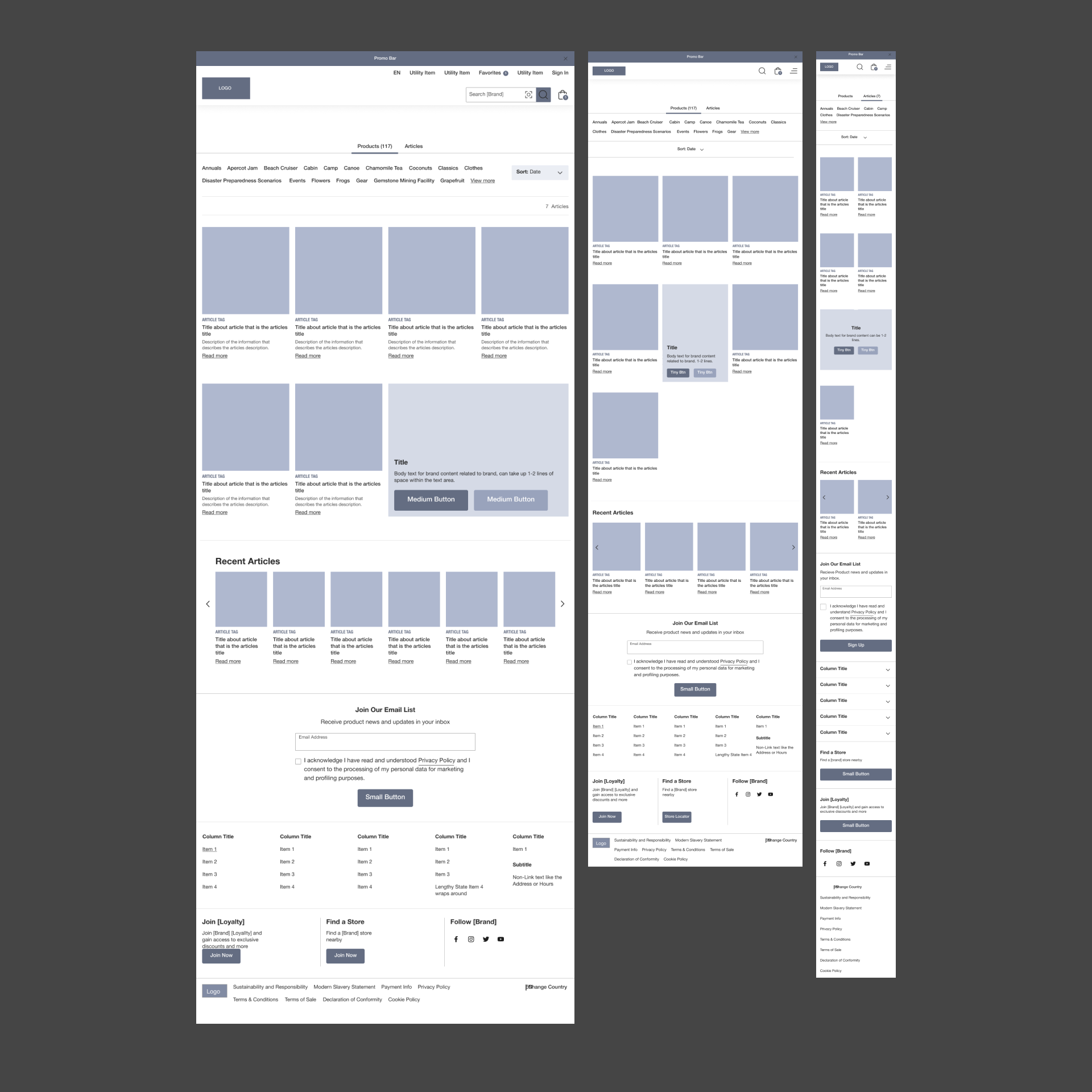
We began by constructing UX components, such as navigation menus, product carousels, and filtering options, to establish a cohesive design system for the entire VF Corp website ecosystem. This initiative aimed to streamline the web experience for both the company and consumers alike.
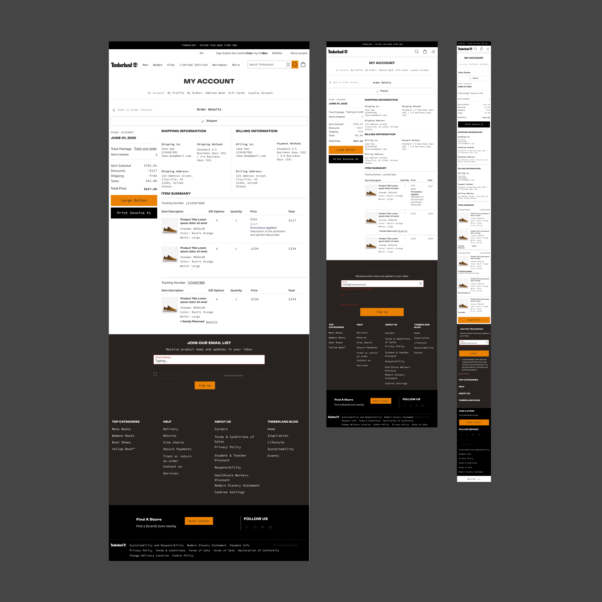
Utilizing these components, we then developed page templates for a secondary design system, encompassing vital pages like the cart, account, product landing, and search results. These templates served as building blocks for consistent page layouts across all VF Corp brands.
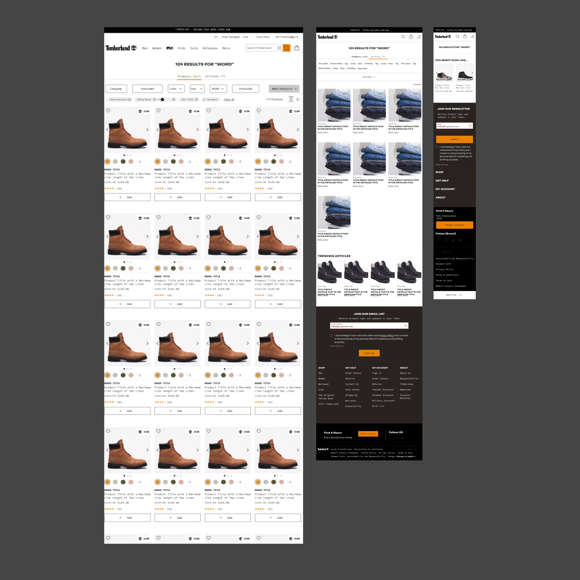
Our focus then shifted to UI customization, tailoring both the components and page templates to adhere to the unique creative guidelines of each brand. This approach ensured brand coherence while maintaining individuality across the VF Corp portfolio.
Throughout the process, we fine-tuned these systems for each brand, making adjustments based on specific needs and preferences. This iterative refinement ensured optimal functionality and aesthetic appeal across all VF Corp websites, delivering a seamless and brand-aligned web experience for users.
What did we make?
Design and Template systems
We kicked things off with two-week design sprints, running them consistently over the course of about a year to tackle all components and templates. To ensure smooth sailing for our developers, we even dedicated a four-week sprint solely to crafting comprehensive documentation. This documentation covered everything from sizing and use cases to the nitty-gritty details of how things should look.
In my role overseeing production, design, and development for Timberland’s UI/UX e-commerce experience, I took the helm for both the EMEA and NORA markets. It was my mission to develop all assets for both websites, ensuring a cohesive and engaging user experience across regions.
Check out the magic below as we demonstrate how our system operates. On one side, you’ll find a wireframe built from UX components, while on the other, we’ve got the fully themed site. It’s a cool side-by-side comparison that shows how our components seamlessly come together to create a sleek and engaging website. From the structured layout of the wireframe to the polished look of the themed site, you’ll see firsthand how our design system delivers a top-notch user experience.


