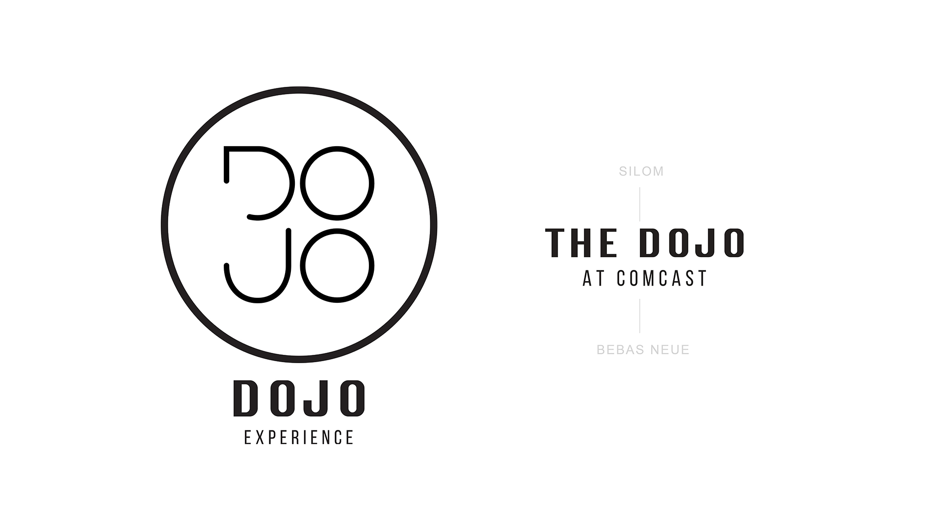
Dojo


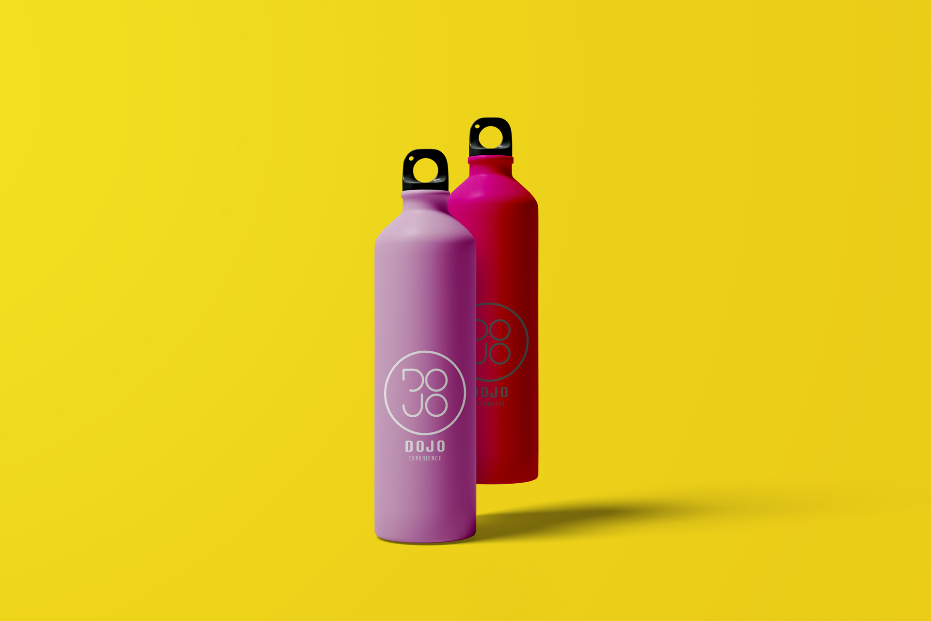
Water Bottle Concept
Water Bottle Concept
Office Signage Concept
Office Signage Concept
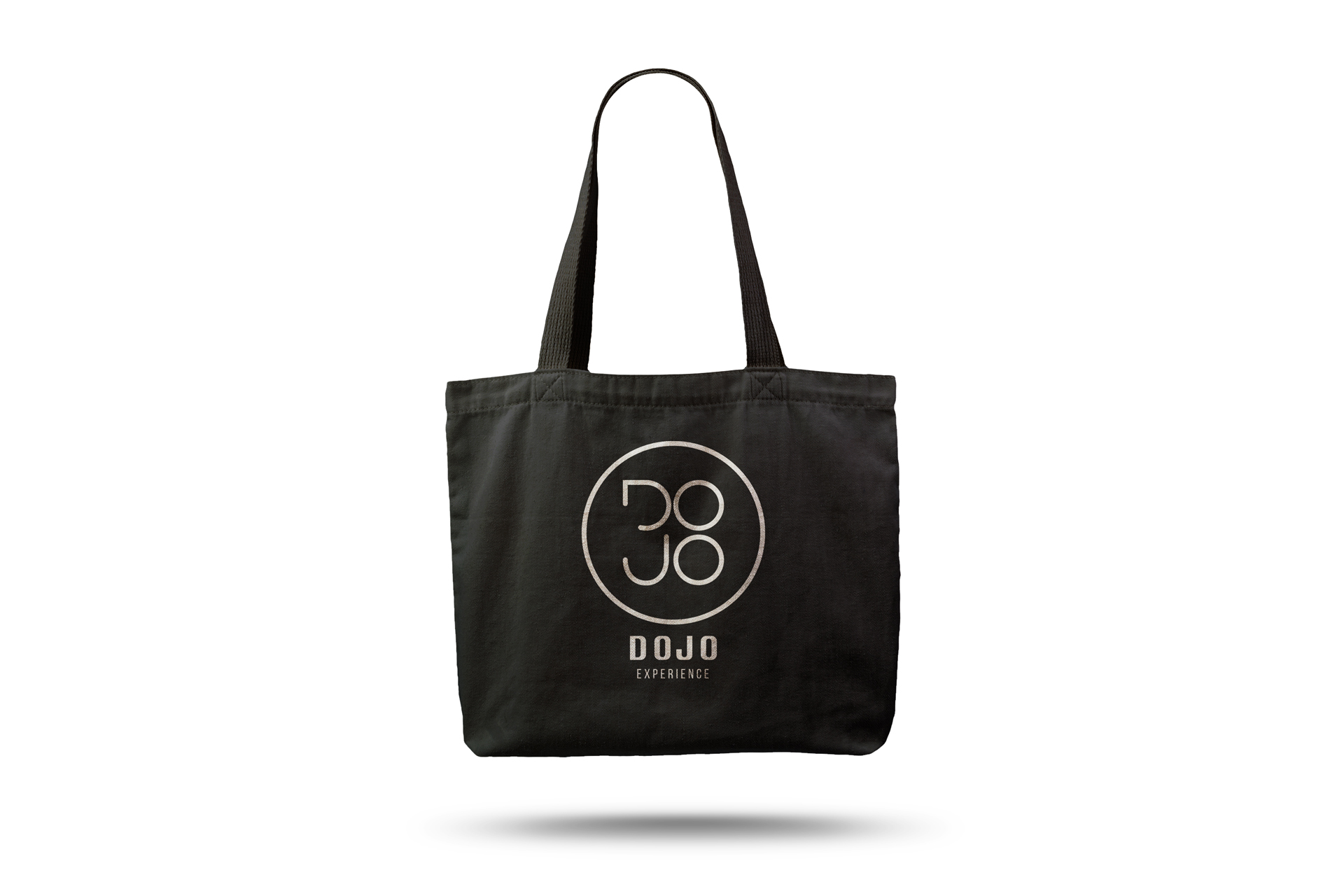
Tote Bag Concept
Tote Bag Concept

Stationery Concept
Stationery Concept


Water Bottle Concept
Office Signage Concept
Tote Bag Concept
Stationery Concept